Pediatric Dentistry Logo
Introduction
There’s something truly rewarding about bringing a fresh, modern spin to a brand that’s been in existence for decades. This was precisely the challenge presented to Arkie Media LLC by our client, a Florida-based dental practice that hadn’t updated its logo in many years. In this case study, we will walk you through our creative process, the turning points, and the rewarding outcome.
Problem
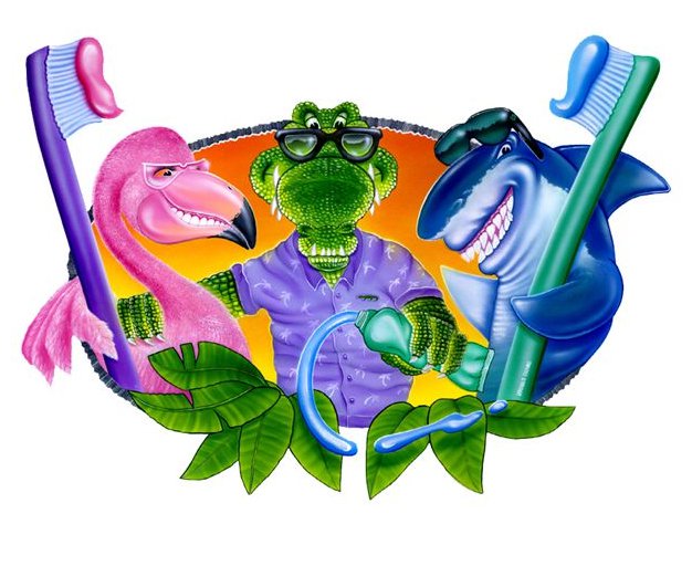
The existing logo of the dental practice was distinctly dated and lacked the style that would resonate with the modern aesthetic of their new facility. The design needed a facelift to reflect an ocean-themed representation fitting the Florida locale while maintaining the professional essence intrinsic to the dental practice.
The Process
The overarching goal was clear – to update the logo for a more modern, welcoming design. We were tasked with incorporating three animals from the previous logo into our initial concepts.
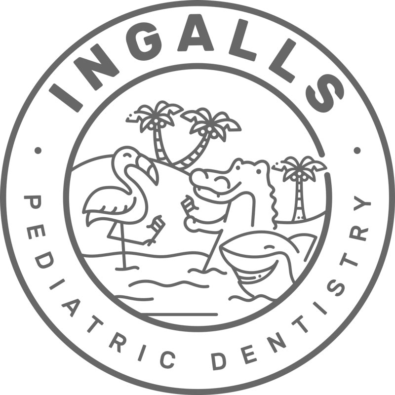
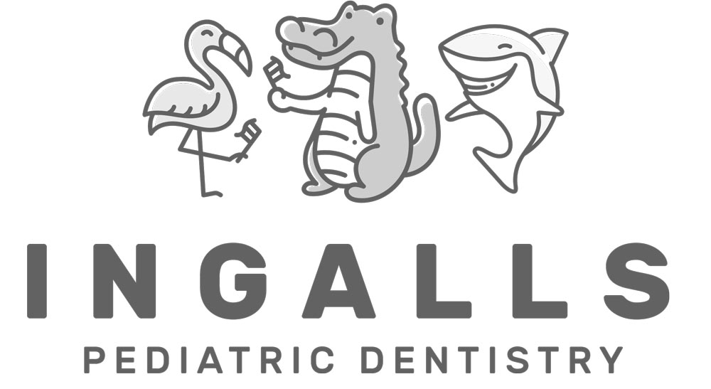
While our designs sparked enthusiasm, the client decided to embrace an entirely new direction – an ocean-inspired theme.
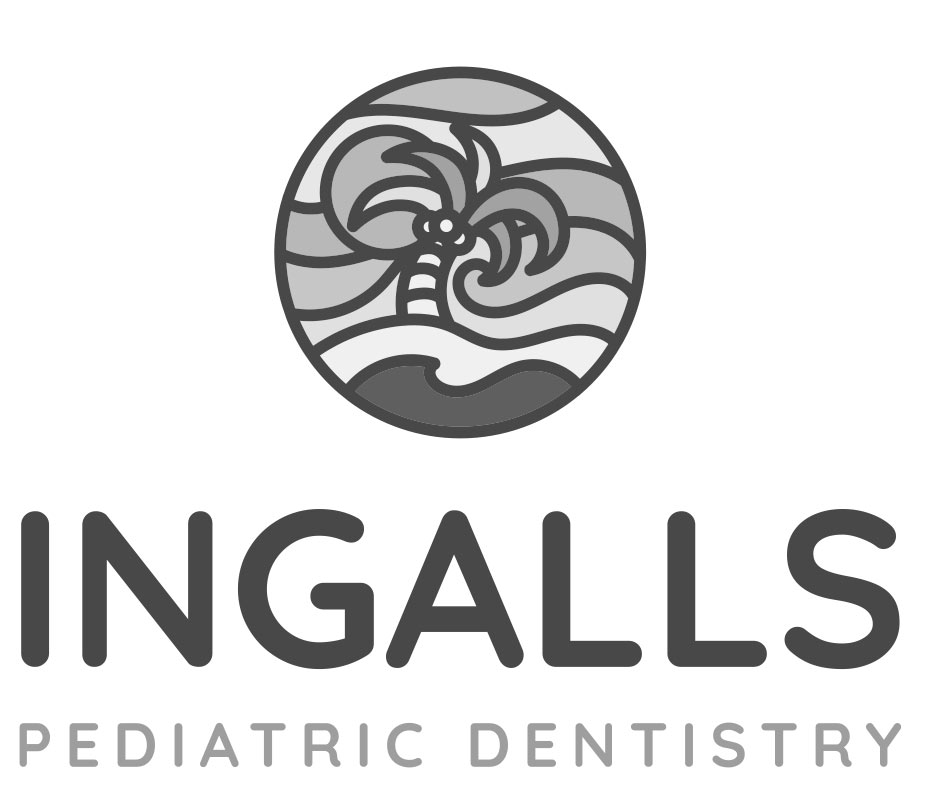
We put our creative hats back on and came up with three fresh designs, each capturing the essence of the Florida locale through waves or palm trees. This new direction allowed us to focus more on the region while preserving the welcoming aspect of the dental practice.
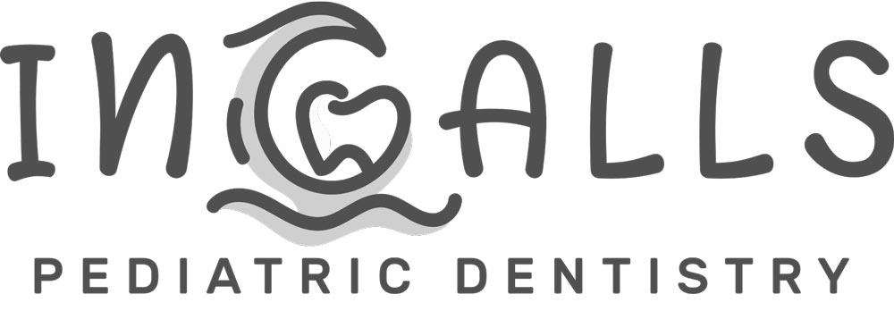
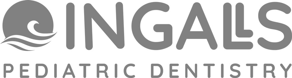
After several rounds of refinement, we struck gold. Our client fell in love with a design that perfectly represented their vision. The winning logo was a perfect marriage of modern aesthetics and a soothing oceanic theme.
Color
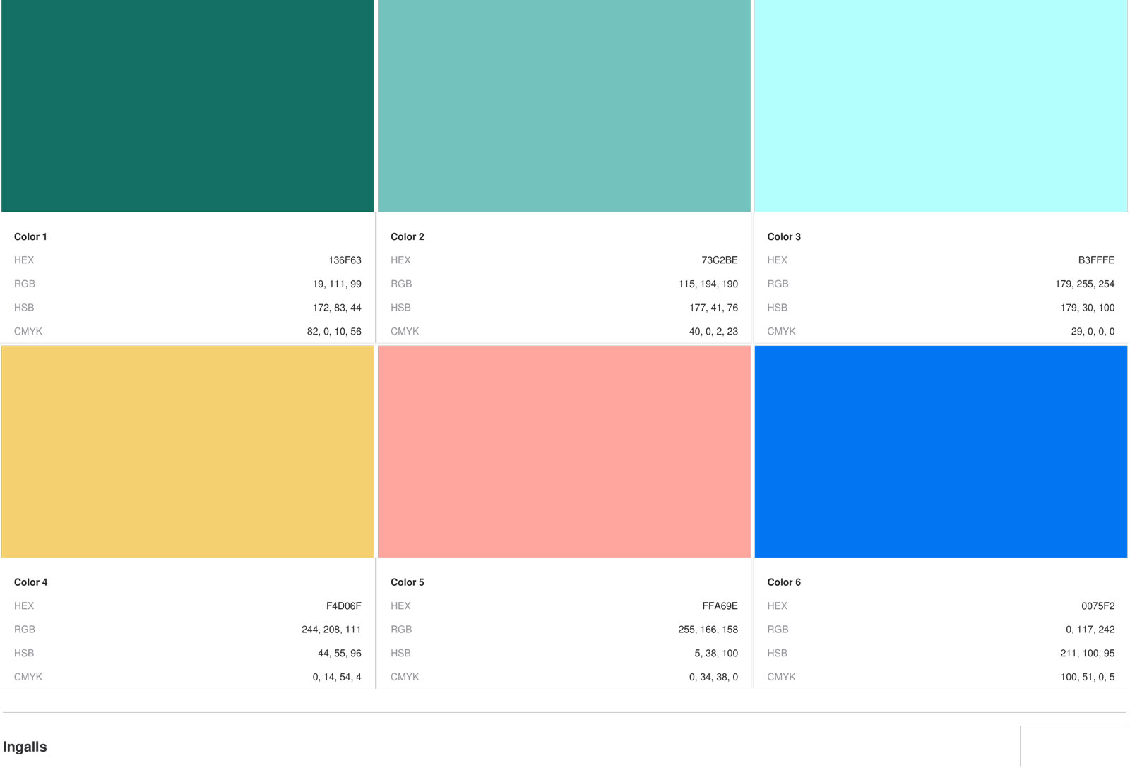
The final phase involved introducing a color scheme that aligned with their website. We offered three distinct variations, each catering to different applications, ensuring flexibility in various marketing collaterals.
Outcome
The logo redesign was a resounding success. We breathed new life into a decades-old brand, aligning it with their updated practice aesthetics and Florida’s unique charm. The result was a thrilled client, now armed with a versatile logo that they could easily apply across all their collaterals, boosting their brand’s visual identity.
![]()